Pyramid's data visualization engine offers users a huge range of core visualizations, as well as the ability to create custom visuals. Each core visualization can be tweaked by adjusting the chips in the drop zones. Pyramid also offers tremendous flexibility when it comes to formatting, which can be leveraged to significantly change the look and feel of each visualization.
Selecting a Visualization Type
There are a few ways to select or change the data visualization; they may be selected from the canvas of a new data discovery, from the visualization toolbox panel, or from the Discover ribbon.
New Canvas
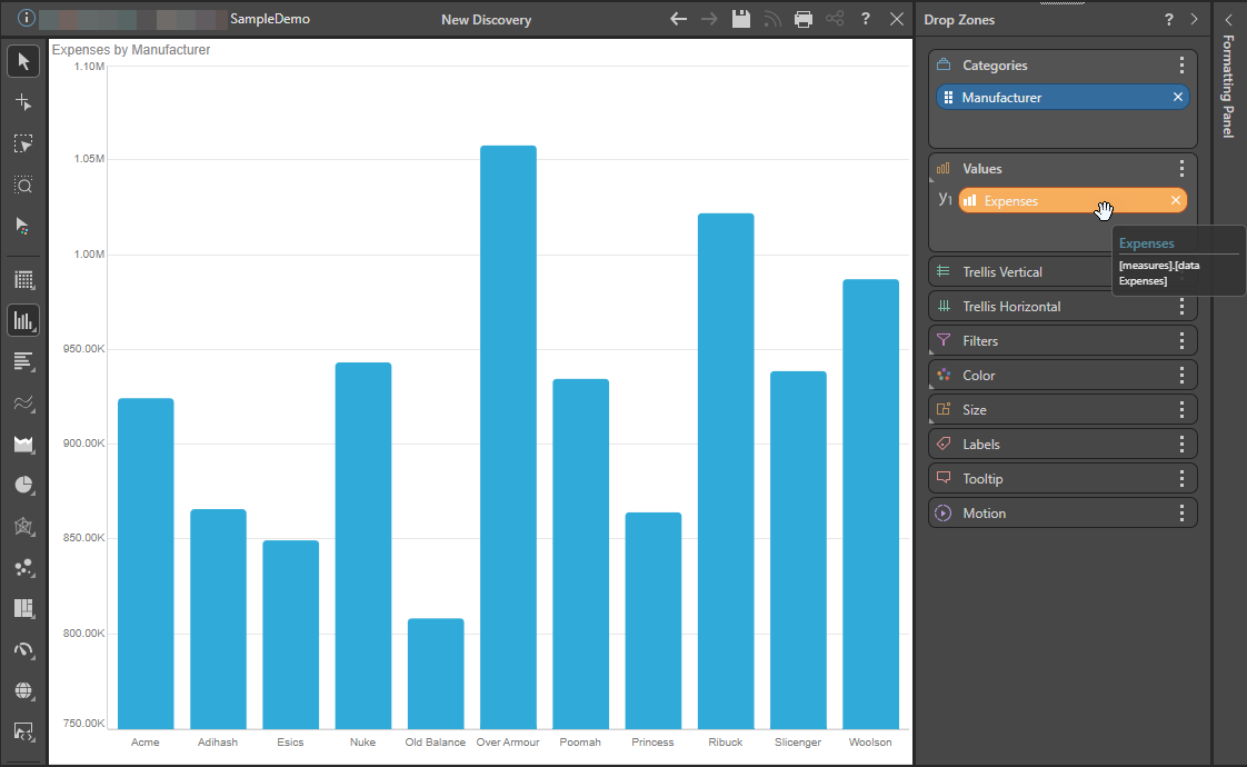
When opening a new discovery, the new canvas features icons representing several data visualizations. You may drag a dimension, hierarchy, or measure onto any of these icons to start building a discovery with the given visualization type.
![]()
In this example, the Manufacturer hierarchy (blue arrow above) was dragged and dropped onto the Column Chart icon (yellow arrow), adding the hierarchy to the Categories drop zone. Once a measure is added (green arrow), the following Column Chart will be rendered:
Toolbox
Once your query contains a dimension, hierarchy, or measure, the Toolbox is shown to the left of the canvas. You can use the non-pointer options in the Toolbox to change the visualization type applied to your query using the following options:
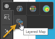
- Visualization Types: Right-click one of the visualization icons in the Toolbox and then select the visualization type you require from the submenu. For example, to change your visualization into a Layered Map you can right-click Maps > Layered Map (orange arrow below):
- Custom Visuals: Use the Custom Visualization Type selector to choose a custom visualization type for visualizing your data. Tip: To learn about each of the custom visualization types, hover your cursor over the custom submenu items to open a tooltip.
- Auto Recommend: Click Auto Recommend to prompt Pyramid to select the most appropriate visualization type for the data that is currently added to your visual. Right-click to select from a set of recommended visualization types.
- Click here for more information about the Toolbox options
Report Ribbon
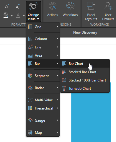
You can also change your visualization type from the Change Visual menu in the Report ribbon.
There are two sets of options on the Change Visual menu, both of which change the appearance of your visual for analytic purposes:
- The first submenu, Visual AI, offers a set of recommended visualization types generated for the current data by Pyramid using its AI-driven Smart Recommendation engine. Given your current data, this option suggests the most appropriate visualization types. For more information, see Smart Visualization Mechanics.
- The other submenus offer each of the visualization types for selection. You can select these options regardless of the current query data. For details of all available visualization types, see Discover Pro Toolbox.